2012 — Lead UX Designer
Virgin Mobile
Website Redesign
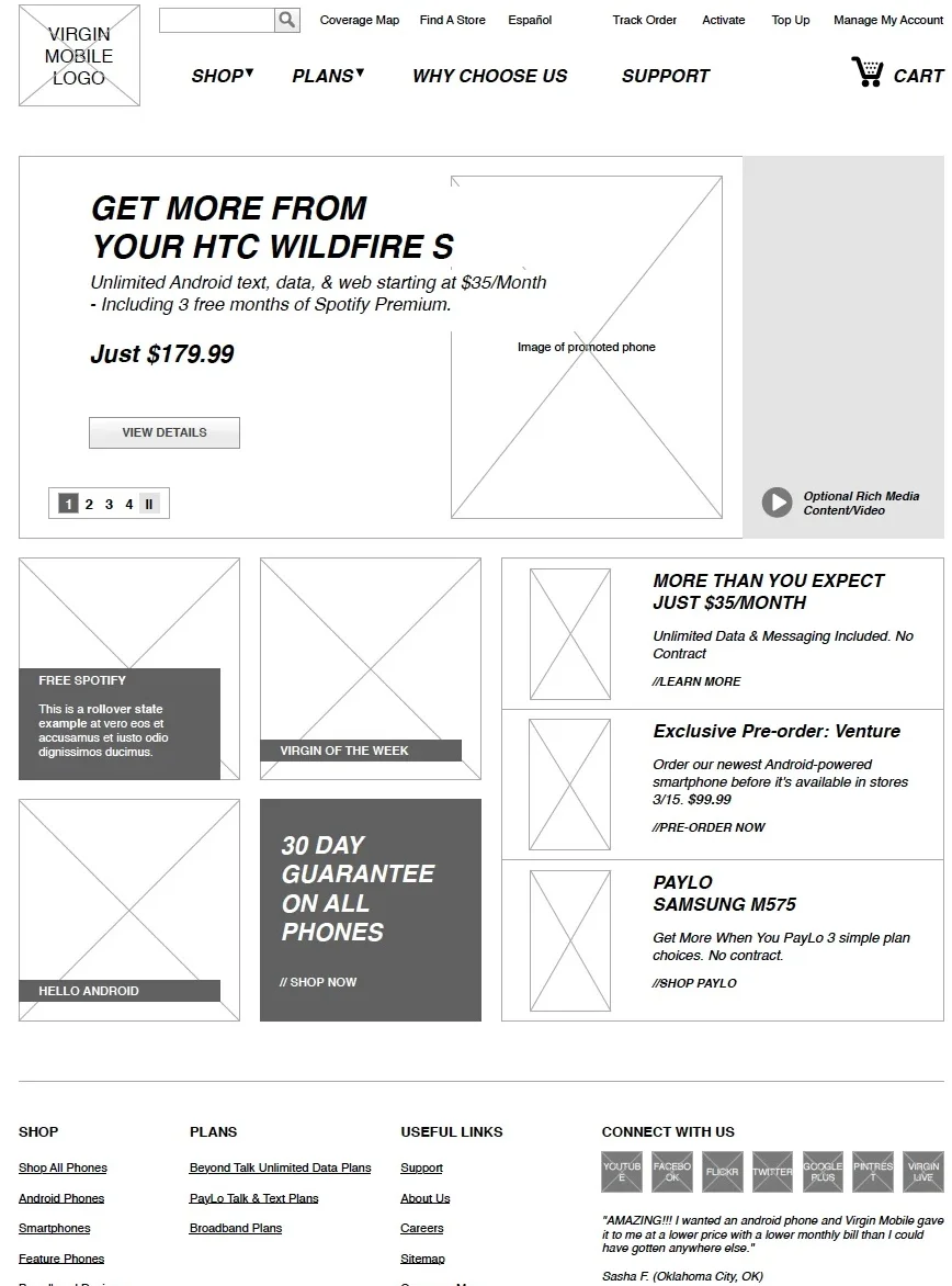
The Virgin Mobile site was built around PayLo, the feature phone line the brand had grown on. It was all red and white, visually dated next to competitors, and hadn't been designed to sell smartphones. That changed when Virgin added Android phones to their lineup and decided the brand needed to match.
The redesign introduced a new visual direction: purple and magenta gradients, a clear break from the red-and-white PayLo brand. The challenge was making the site work for two distinct audiences. PayLo customers were buying feature phones on prepaid plans. Android customers were evaluating smartphones on a different set of criteria. The plans page needed to handle both journeys without sending either audience through the wrong one.
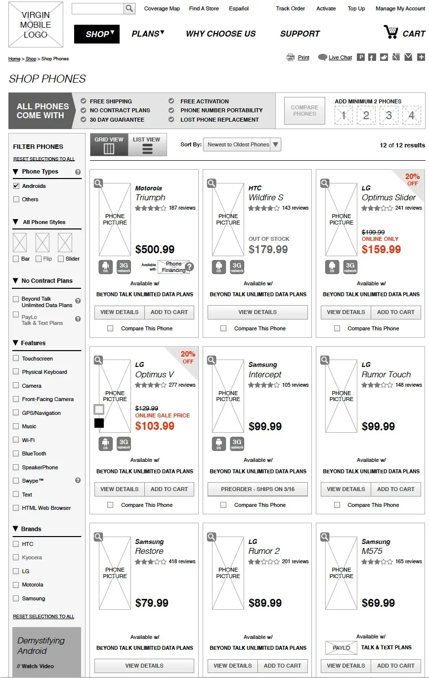
Product tile logic was more involved than it might appear. A tile for a phone in a retail context carries a lot of potential states: on sale, color variants, out of stock, new arrival. Mapping all of those states before design started made the component system manageable.
The redesigned site went live after eight months. Virgin reported a 28% increase in online sales.
- Client
- Virgin Mobile
- Role
- Lead UX Designer
- Timeline
- 8 months
- Result
- 28% increase in online sales